The best HUDs in gaming
Rhianne Ward
Note: this post has been transferred over from my old Wordpress blog. I could go through the trouble of reformatting everything with supporting images and italicisation and whatever else, but I don't really have time to do all that unfortunately, and I'd prefer to spend my time writing new things than labouring over the old. So, if anything looks a little weird or messy, that's why. I hope you enjoy it regardless!
I play a lot of video games, and when you play enough games, you start to notice aspects of them that really agitate you. For example, my main gaming gripe right now is quest markers on compasses and minimaps. Playing recent games like Banishers: Ghosts of New Eden and Final Fantasy VII Rebirth has revealed to me that games built around exploration are made way less fun with a GPS system telling you exactly where to go, how to get there, and your distance to the thing. Moreover, it really bothers me when games simply tell you where points of interest are with a little icon, when in the context of the game, your character should have no idea it’s there. It removes so much of the joy in stumbling upon a cool new discovery, or even simply a gorgeous view to enjoy. It turns games into checklists, and it feels like work. I hate it!
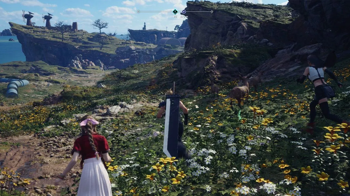
Final Fantasy VII Rebirth‘s compass looks unintrusive, but you’d be surprised how distracting it is.
Originally, this post was going to be a rambling mess where I simply vent my frustrations about this small thing that’s usually fixable in the settings menu by simply turning the indicators off, but I don’t like to be simply negative and call it a day. It makes me feel a little guilty, given that these features, while making my brain turn to mush, are made by people who put a lot of thought and effort into them. Ultimately, I’m not a designer or a developer in any way; I just play games for fun and write about them sometimes. So, instead, I wanna take a minute to talk about the games who took a unique approach to their HUDs – or heads-up display, if you’re not a crazy smart genius like me who knows words sometimes – and created something memorable. Games that go the extra mile and take risks with convention should be celebrated after all! Also, they solved a very specific ‘me’ problem so I owe them something out of all this.
So what kind of HUDs even are there? Well, since we were on the topic of exploration, there are lots of ways you can approach that. There are the aforementioned villainous quest markers to get you where you need to go straightforwardly. Sometimes a game might have multiple quest markers on the way to your destination, creating a route of sorts. Horizon comes at it from this approach, and Banishers allows for it too. Grand Theft Auto has a version of this with its GPS-style coloured route on its minimap that gives you the quickest (legal) route to your objective. However, I find this approach so utterly mind-numbing. For one, it requires basically zero engagement from the player, other than to simply glue your eyes directly to the marker and follow it to the goal. If you’re more a ‘destination’ bitch than a ‘journey’ girlie, then I can see the appeal, but in practice I often find I won’t allow myself to take in my surroundings at all, so if there’s a quest later with less precise directions, I get lost immediately because I’m not committing the environment to memory like I ought to.
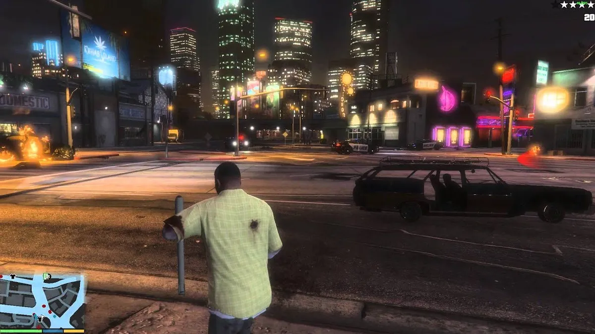
Grand Theft Auto V‘s minimap is helpful and slick, but you’ll spend most of your time staring at that corner of the screen than you will actually taking in the world.
So, is the solution to simply remove the minimap entirely? Sounds risky, but I love a little danger, so let’s give it a go. When it comes to exploration in games, I’m of the school of ‘less is more’, and one such beautiful example of that is found in Ghost of Tsushima. Tasked with adventuring across the island of Tsushima, Jin Sakai must use his connection to his homeland in order to navigate its perils. The result of this is a virtually empty HUD, and the guiding light, as it were, is the direction of the wind. It requires observance from the player to see which way the breeze blows, but also taking into account the geography of your surroundings, so as to effectively navigate the many hills and cliffs of the island. Directing the player to points of interest are the local fauna, such as foxes or birds, which can be followed to find different activities to partake in. The tasks themselves get pretty boring after a while, but the feeling of noticing a little inari running through the brush and pursuing it back to its sacred tree, never got old. It felt rewarding to be keeping an eye out like that.
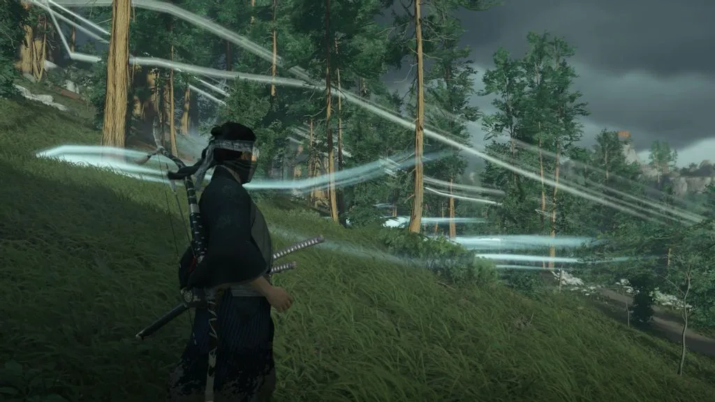
In Ghost of Tsushima, the wind is what carries you to your destination. If you don’t see the white wisps, you can always examine the direction the grass and trees are blowing.
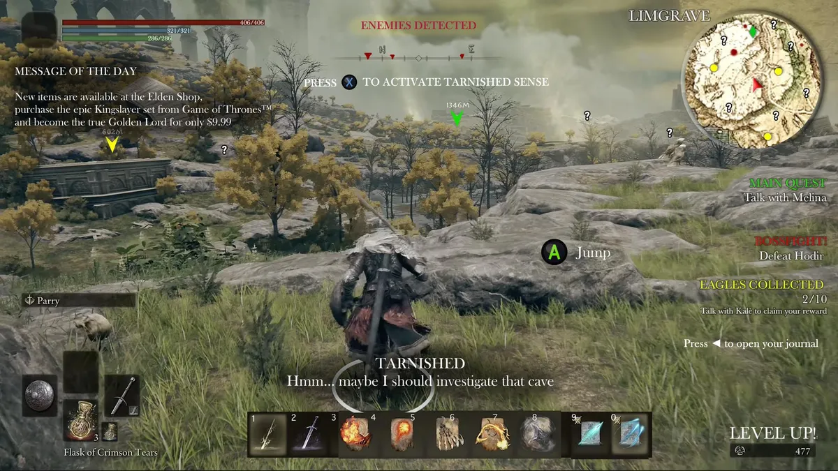
Another game that does this approach well is Elden Ring, which forgoes the wind directions in favour of giving you literally nothing but the promise of something cool once you reach the big fucking structure in the distance. NPCs will give you hints as to where you might find the cool things, but for the most part it’s just you, your compass, and whatever markers you decide to place down personally, which appear as huge beams of light that fire into the heavens and can be visible from basically anywhere. You have a map which you’re able to fill out with fragments you find in the world, but using it requires you to actually examine the contents. It’s a hand-drawn map presumably made by someone in-universe. It doesn’t tell where things are until you find them, so using this map to get around feels like you’re actually plotting a course and using the tools at your disposal to get where you want to go. It takes the oftentimes boring process of going from A to B, and makes the space in between its own engaging experience. Sometimes, you don’t even need the map, because the place you’re going to enormous and visible in the distance, in which case you can make your way there entirely organically. Elden Ring is made up of so many huge open areas, which makes the places of interest stand out easily. It’s incredible world design, and very few games have managed to come close to its mastery.
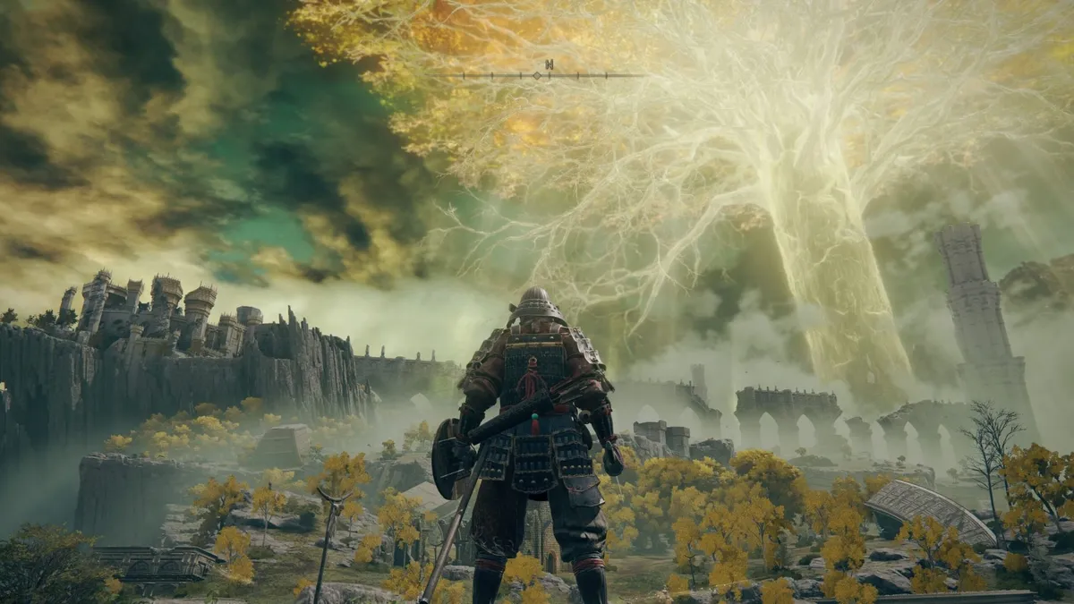
Elden Ring‘s HUD is stripped down as much as possible, to encourage using the environment as your motivation to explore.
But sometimes the best HUD isn’t always no HUD at all. Obviously, there are certain games with more complex mechanics that need to communicate more information to you in the moment. Shooters, for example, will generally give you a live read-out of your ammo count, your health, and so on. The classic design is shoving your ammunition numbers in the corner of the screen non-diagetically, like in Call of Duty or Halo. That being said, I like Halo’s approach to it a little more. I enjoy the way it displays remaining ammo in your gun before you need to reload as individual bullets in a line. What it lacks in precise values, it makes up for in personalisation. Every gun has its own unique ammo count look, and that’s pretty cool attention to detail, I think. Also, given that Master Chief spends the whole game in a high-tech combat suit, having a bar on the top of your screen telling you your shield levels can work as an in-universe inclusion, and I love it when games go the extra mile to justify their HUD designs.
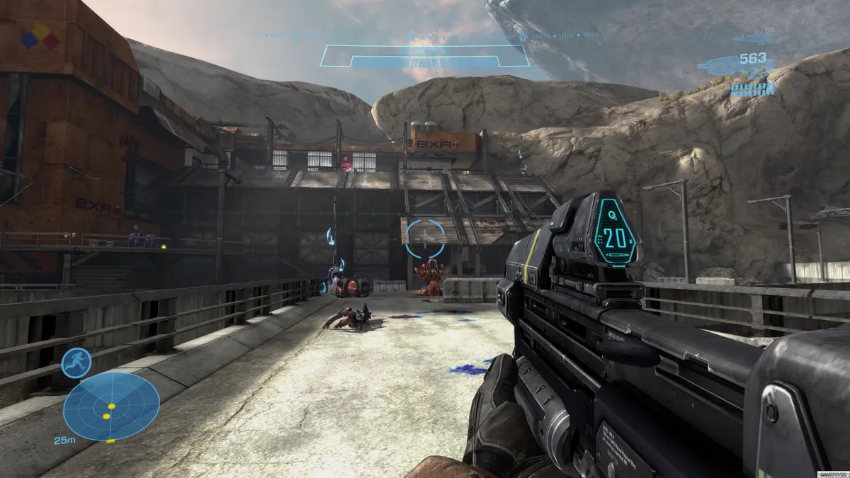
Halo‘s HUD design is instantly recognisable for a reason: it rules. Gives you all the info you need, and not so much as to overwhelm.
My favourite version of this, however, is definitely Dead Space. It takes that approach to justifying every HUD element as an in-universe feature to insane lengths by also making the game’s inventory, map, and objective tracker diagetic. In order to check where you need to go next, the player character Isaac needs to pull it up as a holographic display, and manually search for it. His head will even move to track your navigating through the inventory screen, turning what is typically a mindless process into an action your character is doing himself. It’s a really clever method of grounding you in the world and making Isaac feel like more than just a vessel for the player.
Your ammo read-outs and health are also in-universe elements. The amount of rounds in your guns in displayed on top of the weapon in clear view at all times to both you and Isaac, and health is represented by a tube that runs along Isaac’s spine, helpfully colour-coded to reflect the level of danger you are in at any given time. I really like the effort that went into all of this; it says a lot about the passion that goes into these games when developers dare to try something new. It works entirely in Dead Space’s favour. Even if it didn’t really work though, I would still respect the attempt.
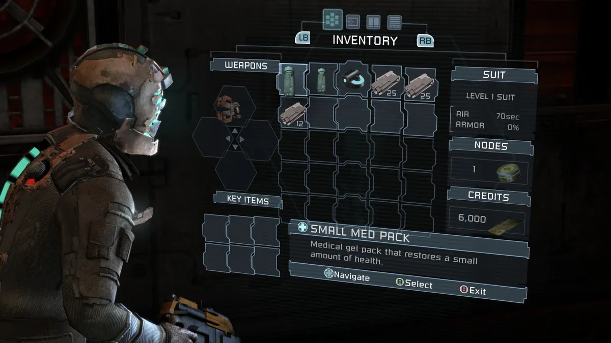
I don’t think any other game has managed to nail exactly what Dead Space does with its UI. Its commitment to the design is staggering.
At this point, you might be thinking that I’m arguing diegesis is what makes a game’s HUD good, and while that’s generally my preference, it isn’t necessarily true. Take the recent Persona games, for example, particularly Persona 5 and Persona 3 Reload. Being turn-based games, the depiction of combat in-game isn’t necessarily literal, but merely a design choice that interprets a fight with greater focus on strategy rather than twitch action. As such, what you’re given as options for combat exists within menus, which is a fact of turn-based games that can be a turn-off for those who aren’t too fond of the gameplay style.
The Persona games resolve this by being the most stylised, fluid version of this as possible. Turns in these games don’t feel like a laborious task because the games are carefully designed to get you where you need to go within seconds. Want to go for a simple melee attack? That’s just two button presses away. Would you rather let loose lightning from the heavens? Well, again, you’re only a couple steps away from your dream, OR, if it’s already a known weakness of whatever enemy you’re fighting, you can just hit the ‘assist’ button and the game will navigate to the move for you. It sounds a little hand-holding, but in practice it cuts down on time considerably and makes every fight feel fast and frantic, as it ought to. Of course, I would never argue that all turn-based games should match the refinement of Persona, because to do so would be incredibly ignorant of the time and effort put into the visuals and optimising the combat flow, but I still want to at least shout it out because it’s awesome.
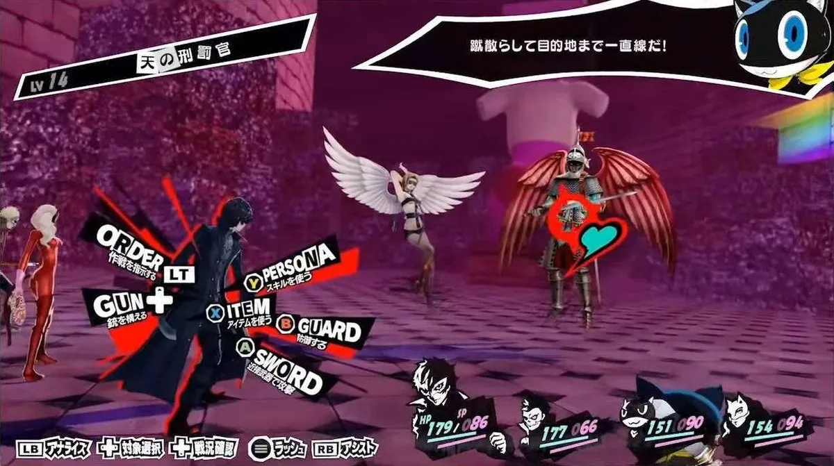
Persona 5 Royal‘s HUD might look cluttered, but it is a marvel in motion.
I’ve spent a lot of time talking about different approaches to HUD and UI designs, but what if I told you there was a game that did it all, and more? A beautiful symphony played by the finest orchestra in gaming. If you, like me, are a fan of quirked up androids goated with the existentialism, then you already know what I’m talking about: NieR fucking Automata.
Let me preface the unsightly amount of praise I’m about to unleash upon Yoko Taro’s masterpiece by returning to an issue I had earlier with contemporary open world design. I fixed my issue with Banishers and FFVII Rebirth by simply turning off the HUD element that was bothering me entirely. This works fine and it ultimately made the games more fun for me, but in practice it feels less like a cure and more of a plaster; treating the symptoms but not tearing the issue out by the root. At the end of the day, these features were on by default, and so, to some extent, the games are designed around their presence. As a result, I often found myself getting lost because the world design isn’t always built to facilitate the absence of these elements. I mentioned ways in which certain games negated these issues by simply not including them in the first place, trying for a different approach instead. This is great, and I love those games for it. However, NieR Automata opts for a more bizarre, but simultaneously genius, alternative, by baking the removal of these HUD elements into the game world itself.
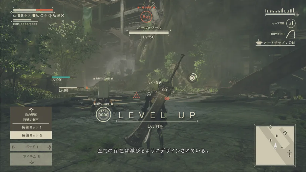
With all the HUD elements activated, NieR Automata turns into a headache-inducing mess. Luckily, it encourages you to turn them off!
If you saw an average clip of the game, you might think that I am going insane right now. “What are you talking about Rhianne, this game has a minimap and quest markers, a health and EXP bar, enemy health bars, and even an indicator to show whether or not you can save the game if you’re standing in the right place. By all accounts, you should hate this!” Ah yes, you would say that, wouldn’t you, voice in my head? You fool, you pathetic worm. Just wait until I tell you about NieR Automata’s greatest feature: the plug-in chips.
This game does the Dead Space thing of making the HUD elements an in-universe feature, because the player character 2B is an android and therefore capable of having read-outs of all this information whenever she wants. However, rather than simply being a clever way to ground the game’s visuals in the world, NieR Automata ties these features in as an upgrade-of-sorts which must be active in the game’s skill system.
Mastering NieR Automata’s combat to a point where you don’t even need the HUD info is what becoming God probably feels like.
The chip system allows the player to unlock special moves, increase their health, and so on, but HUD elements are considered a part of that system. They are put into practice by default, but you can remove them at any time to make way for more skills. In a sense, the game is encouraging you to take out these features, because doing so allows you to diversify your build even more than you might have previously. If you don’t like the minimap, you aren’t simply removing it as a personal preference, but you get something back in return for hindering your navigational capabilities.
It legitimately drives me insane how creative and satisfying a solution this is for those of us who prefer to clear up the visual clutter of games and let the game world speak for itself. I genuinely think about this at least once every few days; it has infected my brain and set the bar for games way too high. My life exists in a pre- and post-NieR Automata state, and it is making me feel crazy. It also works as a sort of small rebellion against the game world itself. NieR Automata is all about uncovering truths about your existence, and unlearning the lies taught to you by authority figures with ulterior motives, using you as a pawn in greater schemes. It feels weird to say because it seems to run counter to the sensible design decisions of pretty much all games, but the HUD of NieR Automata feels deliberately designed wrong, so that you can develop the personal wherewithal to change it to your preferences. It’s like a microcosm of everything the story communicated about agency and free will, and that’s why it’s not just one of my favourites games ever, it’s also got the best heads-up display ever conceived. To me, at least.
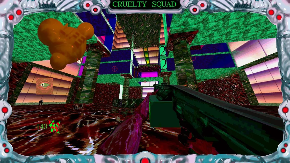
Not a joke. This is what Cruelty Squad looks like. It is magnificent.
These are just a few examples of games doing unique things that I love, but there are so many wonderful ones I didn’t mention at all. Cruelty Squad’s anti-satisfaction approach to its HUD is beautiful to me as a reflection of the gross and inhuman world you exist within, Pacific Drive forgoes a traditional HUD for a driving game in favour of having the player manually look at and interact with parts of the car one at a time, allowing for a more intimate vibe that weirdly makes you more attached to your vehicle, and Baldur’s Gate 3 has this cute feature where clicking on the character portraits enough times causes that character you’re bothering to tell you, the player, to fuck off. A game’s HUD isn’t just an avenue for relaying information; it’s also a canvas upon which creativity can flourish. I think it’s beautiful that even a game’s most seemingly innocuous elements have such care and thought out into them. It’s a constant reminder that people are the ones behind these amazing works of art we call video games, and I’m looking forward to being continuously surprised by HUDs for years to come.